Laguna Seca measures 3.601 kilometres in our map trace and 3.602 in the circuit's own published figure — a one-metre disagreement across eleven corners cut into the dry hills above Monterey. What follows is not a decorating guide. It is a studio note on how a traced print of that layout behaves inside a room, and how three practical questions decide what sits beside it. We will ask the questions in order, branch on the answer, and end with a table that maps every combination to a single recommendation. The palette of the circuit itself — sand, oak, dry grass, the pale grey of the concrete apron — is the constraint we work against.
Question 1: Is the Room Warm-Neutral or Cool-Neutral?
Before matching anything, the room is decided for you. Stand in it around midday with the curtains open and note what the whites read as. If the whites lean toward cream, straw or bone, the room is warm-neutral. If they lean toward paper, ash or slate, it is cool-neutral. This is the single most consequential question because Laguna Seca's own palette is warm — the hillsides above Monterey are dry-grass yellow for most of the calendar year, the exposed earth reads sand, and the concrete run-offs sit at a warm mid-grey. A trace of the circuit carries that temperature whether the print is monochrome or not. Put a warm object into a cool room and it starts to look yellowed. Put it into a warm room and it disappears politely into the wall. Both outcomes are legitimate. Neither is accidental.
If Yes — the room is warm-neutral
A warm-neutral room already speaks the circuit's language. The print will sit inside the palette rather than argue with it. What you want here is contrast at the value level, not the temperature level: keep everything warm, but let the trace be the darkest thing in its wall zone. That means matting the print with a bone or oyster board rather than paper white, and framing in a mid-tone timber — white oak, ash, or a light walnut — instead of black. Around the print, avoid other warm graphics. One warm object per wall zone. The room's job is to give the trace space to be legible.
If No — the room is cool-neutral
A cool-neutral room needs the print to introduce warmth rather than resist it. Here the print becomes a small heat source in a grey-white field, and the framing decides how visible that heat is. A black frame will read as a hard rectangle and push the warm interior of the print forward; a raw aluminium or a pale-timber frame will let it drift. The mistake is trying to neutralise the print into the room — desaturating the palette to make it "fit" reads as apology. Better to let the eleven-corner layout sit as the one warm event in the wall, and repeat the warmth once elsewhere — a leather tray on a low table, a stoneware lamp base — so the print is answered rather than isolated.
Question 2: Is the Print the Only Circuit Object in the Room?
The second question is quieter but decides whether the print does its own work or joins a conversation. A single trace on a wall is a subject. Two traces on the same wall become a set, and the set has different rules — it wants shared framing, shared matting, shared eye-line, and enough negative space between prints that each one can still be read as geometry rather than pattern. Most rooms we visit that fail with circuit prints fail here: someone added a second layout because the first one was successful, and the two prints started competing for the same corner of the eye. It is worth answering this before anything else about colour, because pairing changes what the print's neighbours are allowed to be.
If Yes — the print stands alone
If the Laguna Seca trace is the only circuit object, treat it as a single anchor. The palette advice above applies without adjustment: temperature-match the frame to the room, matte to the warm side, keep the wall zone quiet. What sits on the same wall is not another map. A single small object — a ceramic vessel, a book spine, a shallow shelf with two items — is enough to give the eye a second stop. The print is doing the geometric work; everything else on that wall is punctuation.
If No — there is a second circuit or map in the room
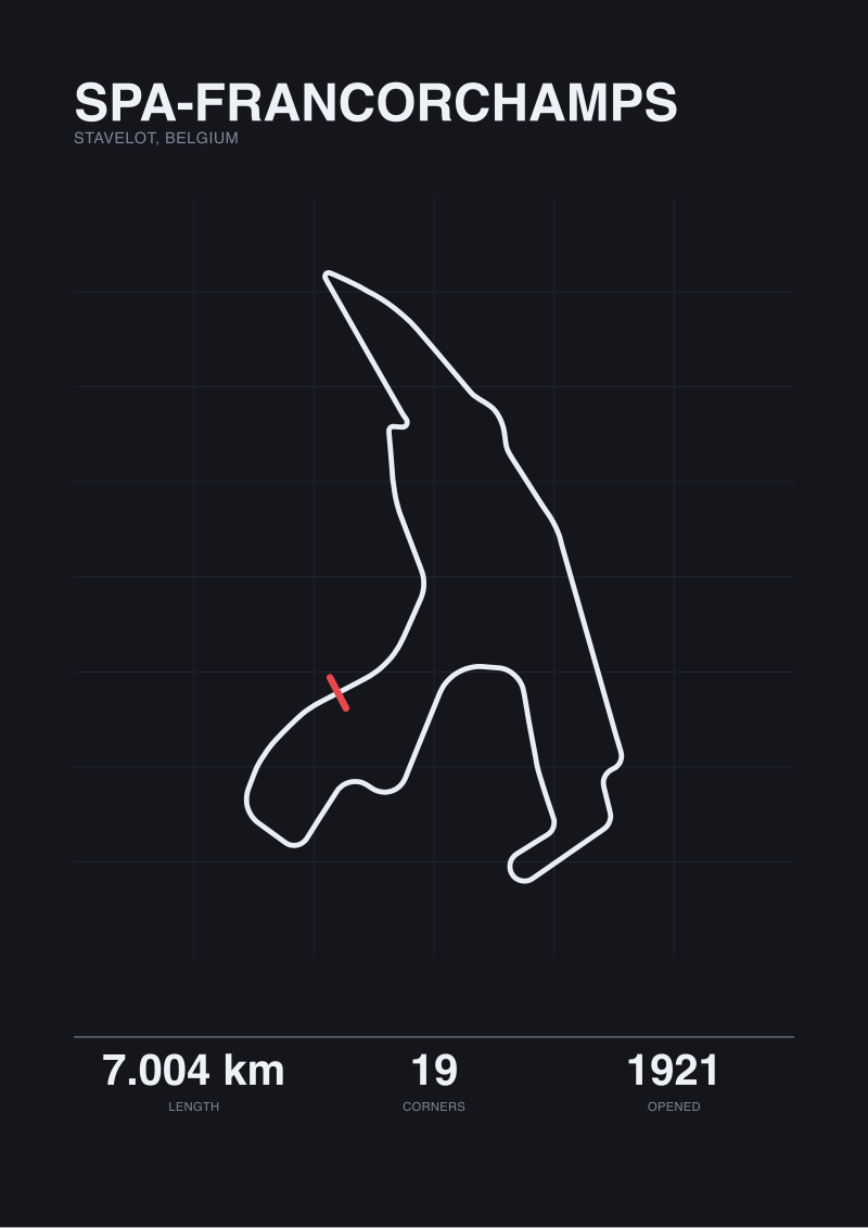
If a second layout is already framed on the same wall or in the same room, the palette question opens up. Two prints hung as a pair should share matte tone and frame material — the pair reads as a set only if the framing is the shared vocabulary. Colour-wise, the two prints can be temperature-neighbours (both warm, e.g. Laguna Seca with Sonoma or Road America) or deliberate opposites (Laguna Seca warm, Spa cool), but not middle-distance strangers. If they are opposites, the room needs a third warm-anchoring object to hold Laguna Seca's temperature in place, otherwise the cool print wins the wall by default.
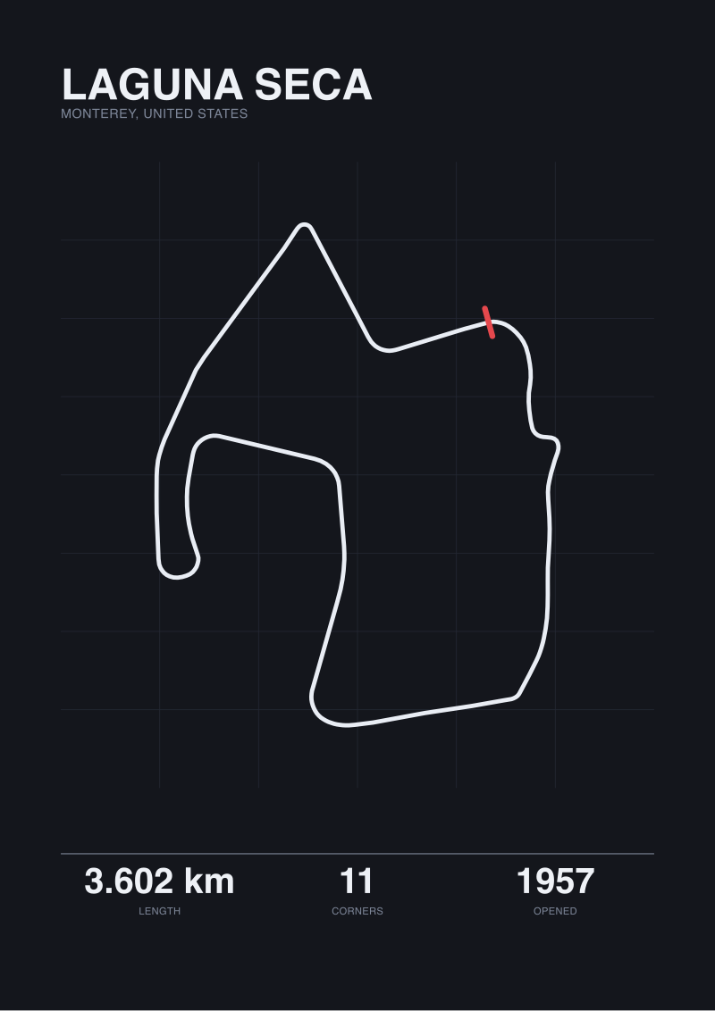 Laguna Seca
The print from this article · from €29.95
View the print →
Laguna Seca
The print from this article · from €29.95
View the print →
Question 3: Should the Layout Read First, or the Landscape?
The third question is about hierarchy inside the print itself. A traced layout of Laguna Seca can be printed so the eleven turns and the 3.601-kilometre ribbon read first, with the surrounding terrain implied. Or it can be printed so the Monterey landscape reads first — the ridgelines, the dry-grass fields, the topographic band that gives the Corkscrew its drop — with the layout embedded in it. Both are legitimate ways to draw a circuit. They are not the same object in a room. The layout-first version is a diagram and belongs near diagrams (books, technical drawings, a desk). The landscape-first version is a picture and belongs near pictures (photographs, framed prints of other places).
If Yes — layout should read first
If the layout must dominate, the room around it should be visually quiet at the scale of the print. That means no competing linework on the same wall: no wire-frame chairs directly beneath, no radiator with strong vertical bars, no shelving system whose grid is close enough in scale to fight the eleven corners. The palette around the print can be almost anything provided it is uniform — a single-colour wall works better than a two-tone or a papered wall, because the layout needs edge contrast to be readable at four metres. Frame the print in something structural — matte black, dark walnut, blackened steel — so the rectangle around the layout announces itself as the reading zone.
If No — landscape should read first
If the landscape context matters more than the diagrammatic layout — if the point is Monterey, not the eleven corners — the print behaves like a photograph and can live near photographs. The room can carry more texture: linen, timber grain, a rug with a visible weave. The frame should recede: a thin section, a pale timber, or a shadow-box mount that lets the print's edges read as a continuation of the wall. In this configuration the Laguna Seca palette — sand, oak, dry grass — is doing atmospheric work, and the room should not undercut it with cool-blue accents that pull the eye elsewhere.
If You Answered All Three: The Combination Table
Three yes-or-no questions produce eight combinations. The table below reads Q1 as Warm (W) or Cool (C), Q2 as Alone (A) or Paired (P), Q3 as Layout-first (L) or Landscape-first (S). Each row is one route.
| Q1: Room | Q2: Print status | Q3: Reads first | Recommendation |
|---|---|---|---|
| Warm | Alone | Layout | Matte black or dark walnut frame, oyster matte, quiet single-colour wall, no competing linework nearby. |
| Warm | Alone | Landscape | Pale timber frame, no matte or a bone matte, hang near soft-texture objects, allow linen and grain around. |
| Warm | Paired | Layout | Shared matte black frames, identical matte tone, generous gap between prints, no third graphic on the wall. |
| Warm | Paired | Landscape | Pale-timber shared frames, hang as a horizontal pair at eye-line, treat the pair as one landscape object. |
| Cool | Alone | Layout | Black frame, bone matte, introduce one warm object below the print to answer the trace's warmth. |
| Cool | Alone | Landscape | Raw aluminium or pale-oak frame, no matte, repeat the warm tone once more in the room — leather, stoneware. |
| Cool | Paired | Layout | Shared aluminium frames, cool matte, treat the pair as a diagram set and keep the surrounding wall empty. |
| Cool | Paired | Landscape | Pair the Laguna Seca print with a temperature neighbour, not an opposite, or the cool print will win the wall. |
The table is designed to be read once and then closed. If a row does not describe your room exactly, the closest match is usually the right route — the palette of the circuit does not change, only what the room asks of it. Our own studio prints of Laguna Seca live at our shop if you want to see how a traced layout of the 3.601-kilometre circuit is actually printed at the resolutions this note assumes.
Honest Limits of a Palette Note
This piece does not address seasonal colour shift at Monterey. The dry-grass yellow that dominates the hills for most of the year is a summer-and-autumn condition; in a wet winter the same terrain reads greener, and a print made from a landscape reference photographed in February would carry a cooler underlying palette than the sand-and-oak version this note assumes. We treat the summer palette as canonical because it is the visual identity most viewers of the circuit hold in memory, but that is an editorial choice, not a neutral fact.
It does not address artificial-light conditions. Every recommendation above assumes daylight or a warm-white bulb in the 2700–3000 K range. A cool-white or daylight-balanced bulb (4000 K and above) will shift the print's read toward the cool side and can invert the outcome of Question 1. Rooms lit by fluorescent tubes or high-CRI daylight LEDs need their own note, which we have not written.
And it does not address the print itself as a material object — paper stock, ink density, whether the layout is embossed or flat, whether the trace is printed in the circuit's homologated 3.602 or our map-traced 3.601. Those are separate arguments and each one alters what the room should do around the print. The three questions above are the first three, not the only three.
FAQ
Why does Laguna Seca's palette read as warm rather than cool?
The circuit sits in the dry hills above Monterey, and for most of the calendar year those hills read yellow-to-sand rather than green. The exposed earth on the run-offs reads warm brown, and the concrete apron sits at a warm mid-grey rather than a blue-grey. A traced print inherits that temperature even when it is printed in monochrome, because the paper stock and ink density chosen for the trace tend to match the source palette. That is why a Laguna Seca print behaves as a warm object on a wall.
Should I match the frame colour to the circuit or to the room?
To the room, in almost every case. The print is doing the temperature work already; the frame's job is to give the print an edge the room can read. Matching the frame to the circuit's own palette — a sandy timber, for example — often makes the print disappear into itself. A frame that answers the room's whites (warm-timber for warm rooms, black or aluminium for cool rooms) gives the trace a clear boundary and lets the eleven corners register at reading distance.
Does the one-metre difference between 3.601 and 3.602 kilometres matter for a print?
Visually, no. One metre across a 3.6-kilometre layout is well below the resolution at which any framed print is read, so the two versions look identical on a wall. Editorially, it matters — the map trace and the published figure disagree, and a studio that traces before it draws is obliged to say which measurement its print represents. We use the map-traced 3.601 as the layout basis and note the published 3.602 alongside it, rather than choosing one and hiding the other.
Can Laguna Seca be paired with a cool-palette circuit like Spa on the same wall?
Yes, but only with a third warm anchor in the room. Left on their own, a warm print and a cool print on the same wall settle into a hierarchy where the cool print reads as the subject and the warm one as a supporting note, because cool tones read as further away. A leather object, a stoneware piece, or a timber shelf carrying the warm side of the palette elsewhere in the room stabilises the pairing. Without that third element, the wall unbalances.
How many circuit prints can a single room reasonably carry?
In our experience, no more than two per wall zone and no more than four across a single room, and the four should share a framing vocabulary — same matte tone, same frame material, same eye-line. Beyond four, the room starts reading as a display rather than a lived space, and each individual layout loses the negative space it needs to be read as geometry. A room with one exceptional print does more editorial work than a room with six adequate ones.
Does the Corkscrew show up in the palette advice, or only in the layout?
Only in the layout. The Corkscrew is a topographic event — the elevation drop between turns eight and nine — and it does not have its own colour signature distinct from the rest of the Monterey hills. A landscape-first print will render the topography around it, so the drop becomes visible through the terrain shading rather than through any specific colour. A layout-first print treats the Corkscrew as two connected corners on the trace, at which point its palette contribution is the same warm ink as the other nine turns.
What lighting temperature works best above a Laguna Seca print?
Warm-white bulbs in the 2700–3000 K range. That range sits close to the daylight temperature under which the Monterey landscape was originally read, and it keeps the print's warm palette stable rather than shifting it. Cool-white lighting at 4000 K and above will pull the print toward grey and undermine the temperature match to a warm-neutral room. If the room already has cool overhead lighting for functional reasons, add a warm-tone lamp near the print rather than trying to relight the whole room.
From the collection
New circuits and 10% off your first print.
One email now with your code. No noise after.