The Nürburgring Nordschleife's officially homologated length is 20.832 km. Traced from OpenStreetMap raceway geometry, the same circuit measures 20.746 km. Eighty-six metres separate the two figures. On an A2 poster at 1:15,000 scale, that discrepancy renders as roughly 5.7 millimetres — visible to the eye, invisible to the marketing brief. Circuit poster ideas usually get pitched as a matter of taste. They are not. They are a matter of measurement basis, scale, and which corners the drawing will let you count. This article walks through three hypothetical readers, each of whom wants a different geometry on the wall.
The question "what should a circuit poster look like" has no single answer, because the three variables that decide it — how the length was measured, how the layout is cropped, and how the corners are annotated — do not converge on one drawing. They diverge into three. Let us walk through three hypothetical readers who each want something specific on the wall, and read the geometry each one is really asking for.
Scenario 1: The Nordschleife Completist
Picture a reader who wants the Nordschleife. Not a section of it, not the modern Grand Prix loop stitched to it, not a stylised outline — the full 20.832 km, all 154 turns, drawn end to end at a scale that lets them count. This is the completist. Their frustration with most existing circuit posters is that the Nordschleife gets cropped or abbreviated because it will not fit the aspect ratio print buyers expect. A17 hairpin gets softened. Karussell reads as a single arc when it is a banked concrete radius. Foxhole compresses vertically into a line.
The completist's first decision is which length to render. The 20.832 km figure comes from the circuit's homologation documents and is what the operator publishes. The 20.746 km figure is what our own trace of the OpenStreetMap raceway geometry returns. Eighty-six metres of difference exists because homologation measures the racing line at prescribed corner apexes while a map trace follows the centreline of the paved surface. Neither number is wrong. They answer different questions. A poster rendered from map geometry is a drawing of the road; a poster rendered from homologation data is a drawing of the race. The completist has to choose which of the two they want to hang.
The second decision is scale. At A2 (420 × 594 mm), a 20.7-kilometre circuit rendered with margin comes out at roughly 1:40,000 to 1:50,000 depending on orientation and how the layout's aspect ratio lands. At that scale, corner radii below about 40 metres — of which the Nordschleife has many — begin to lose fidelity. The 154-turn count is a count of surveyed racing corners; on a print at 1:45,000, a reader physically cannot resolve 154 discrete inflections without loupe assistance. Going up to A1 (594 × 841 mm) buys back roughly 40 percent of that resolution. Going up to A0 nearly doubles it. This is why serious Nordschleife posters are large: not for wall impact, for corner count.
The third decision is annotation. The completist wants named corners: Hatzenbach, Flugplatz, Aremberg, Bergwerk, Karussell, Pflanzgarten. There are about a dozen named sections that any Nordschleife-literate reader expects to see and roughly two dozen more that specialists know. Labelling all of them makes the print unreadable; labelling only the famous ones offends the completist. The workable answer is a two-layer print — a clean geometry sheet paired with an annotated key — but that decision belongs to the buyer, not the printer.
Scenario 2: The Spa Section Reader
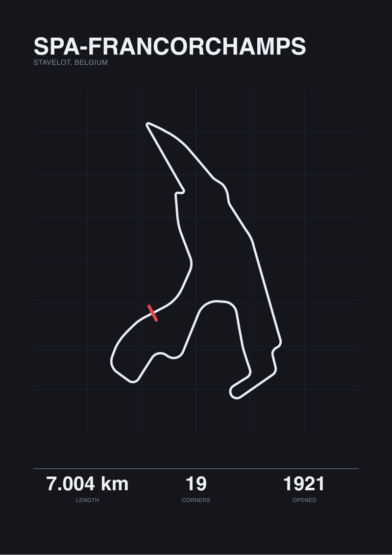
Imagine a different reader. This one does not want the whole circuit. They want Eau Rouge and Raidillon, and they want the elevation. Spa-Francorchamps measures 7.004 km officially and 6.995 km when traced from map geometry — a nine-metre difference, which is a decimal-place argument rather than a visible one. The circuit has 19 corners across its 6.995 km, which works out to one corner roughly every 368 metres of racing surface. That density is deceptive; the corners are not evenly spaced. Between La Source (turn 1) and Les Combes (turn 7) there is one uninterrupted rhythm of complex geometry that includes the Eau Rouge–Raidillon sequence and the long uphill Kemmel Straight.
The section reader wants a poster that gives them this stretch specifically, at a scale where the compression tells the story. Rendered from the same OpenStreetMap trace that gives us 6.995 km for the whole loop, the Eau Rouge–Raidillon sequence occupies roughly 400 metres of running surface. On an A3 print showing only that section, 400 metres renders at roughly 1:1,300 — the corner apexes become individually legible, and the curbing detail resolves. On the full-circuit poster showing all 6.995 km on the same A3, the same 400 metres compresses to about 20 mm end to end. The corner reads as a single kink.
This is why Spa poster ideas divide into two families: circuit-length prints and section prints. The circuit-length family gives the whole geometry and loses the local anatomy. The section family gives the local anatomy and loses the reader's ability to place it in the loop. Neither family is dishonest; they answer different reader questions. Opened in 1921 and rebuilt through the 20th century, Spa is a circuit whose historical significance is largely carried by three or four specific sequences — the section reader knows this and is choosing the drawing that lets them study one.
The two-dimensional trace has a further limit: it does not show elevation. Eau Rouge climbs approximately 40 metres from base to Raidillon crest across that ~400-metre run, a gradient the plan-view drawing simply omits. A serious section poster addresses this either through a paired profile diagram, through subtle contour shading, or through a text callout. The best of them do all three. What they never do is pretend the plan view is the whole story.
Scenario 3: The Silverstone Comparativist
Now picture a third reader, who does not care about a single circuit in isolation. They want a wall of comparisons. Their question is: how do these layouts relate to one another when drawn at the same scale, from the same source, in the same visual language? This is the comparativist. They are the hardest reader to serve, because their taste rests on a discipline most poster series abandon quickly: comparisons must compare like with like.
Silverstone measures 5.891 km officially and 5.881 km on our map trace — a ten-metre gap, comparable to Spa's nine metres. The circuit has 18 turns across 5.881 km, opened in 1948, with a layout that has been substantially revised over its history. On a same-scale comparison sheet showing Silverstone, Spa (6.995 km, 19 turns), and the Nordschleife (20.746 km, 154 turns), the visual disproportion is stark: the Nordschleife swallows the sheet, Spa forms a compact ribbon, Silverstone reads as a tight aerofoil. That disproportion is the point. The comparativist wants to see that a lap of the Nordschleife is roughly 3.5 times a lap of Silverstone.
The comparativist's requirement is that every number on the sheet uses the same measurement basis. If Silverstone is drawn from map-traced 5.881 km and the Nordschleife from homologated 20.832 km, the comparison is quietly corrupted — the reader is placing two circuits side by side that were surveyed by different methods. Our own convention is to render every layout from the same OpenStreetMap raceway trace, then annotate the official figure separately where it differs. This gives the comparativist a like-for-like drawing and preserves the published number as reference metadata.
Circuit de la Sarthe is a warning case in the same family. Officially 13.626 km, its map-traced figure from our OpenStreetMap source returns only 0.793 km — a fragment, because much of Sarthe's lap runs on public roads that are not tagged in the raceway dataset used for permanent circuits. A comparativist sheet that put a 0.793 km trace of Sarthe next to a 20.746 km trace of the Nordschleife would be technically consistent in method and completely misleading in effect. The honest response is either to render Sarthe from a different data source and label it, or to exclude it from the comparison sheet entirely. Silence about the mismatch is not an option. Studios that draw circuits from map data — and this is the discipline behind our own /shop/ — publish which source produced which figure, so the reader can see the argument the drawing is making.
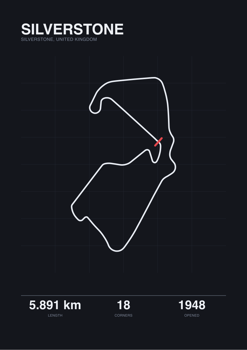 Silverstone
The print from this article · from €29.95
View the print →
Silverstone
The print from this article · from €29.95
View the print →
What All Three Share
Read the three scenarios back to back and a pattern surfaces. The completist, the section reader, and the comparativist appear to want different things, but their disagreement is not about circuits. It is about which measurement, at which scale, with which annotations, the drawing should preserve. In all three cases, the poster's value is decided before any ink lands: it is decided by three prior editorial choices. Measurement basis first — homologation or map trace. Scale second — whole circuit or section. Annotation third — named corners, elevation, or clean geometry.
Every poster the reader has ever hesitated over on a store page is answering these three questions, usually silently. The Nordschleife poster that "looks stylised" is often a map-traced geometry rendered at a scale below the corner-count resolution threshold. The Spa poster that "feels flat" is a plan-view drawing without an elevation companion. The multi-circuit comparison poster that "doesn't quite add up" is mixing measurement bases across its panels.
None of this is aesthetic. It is what the drawing lets the reader count. A poster that hides its measurement basis, compresses its scale below the corner-count threshold, and offers no annotation is decorative in the reductive sense of the word — it makes a circuit unreadable to the person who bought it because they cared about circuits.
Which Scenario Is You
The completist wants the whole layout at a scale where the corner count is physically resolvable. If that is you, the deciding variables are print size (A1 or larger for the Nordschleife; A2 acceptable for Spa or Silverstone) and measurement basis (homologation for a racing document, map trace for a road document). The section reader wants a specific sequence — Eau Rouge, the Karussell, Silverstone's Maggotts–Becketts–Chapel — at a scale where corner anatomy resolves and, ideally, elevation is not omitted. If that is you, the print's job is intimacy with a stretch of road, not completeness. The comparativist wants a same-scale, same-source sheet showing multiple circuits with published figures annotated but not conflated with the drawing method. If that is you, the print's job is proportion.
Circuit poster ideas end up here, at three questions the buyer usually is not asked: what do you want to count, at what scale, and drawn from which measurement. Answer those three and the correct print picks itself.
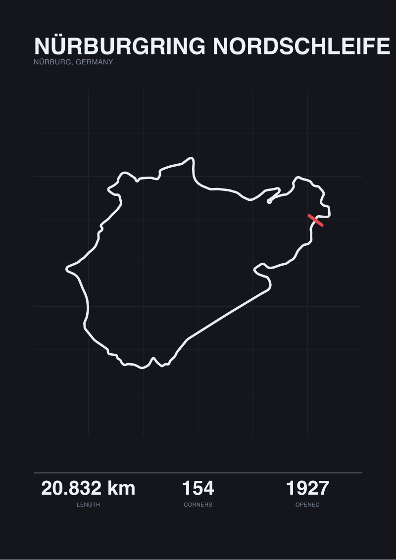 Nürburgring Nordschleife
The print from this article · from €29.95
View the print →
Nürburgring Nordschleife
The print from this article · from €29.95
View the print →
FAQ
Why do map-traced circuit lengths often disagree with the officially published figure?
Homologation documents measure the racing line at prescribed corner apexes, following the path a car is expected to take. Map traces follow the centreline of the paved surface as recorded in a dataset such as OpenStreetMap. The two measurements answer different questions — the race versus the road — so they return different numbers. The Nordschleife's 20.832 km versus 20.746 km and Spa's 7.004 km versus 6.995 km are both examples of this gap.
At what scale does a Nürburgring Nordschleife poster stop being able to show all 154 turns clearly?
At A2 (420 × 594 mm) the Nordschleife renders at roughly 1:40,000 to 1:50,000 depending on aspect ratio, and at that resolution corners with radii below about 40 metres begin to blur into their neighbours. The 154-turn count is nominal at that size — the eye cannot separate every inflection. A1 recovers roughly 40 percent of that resolution and A0 nearly doubles it, which is why large-format prints exist for this specific circuit.
Should a Spa-Francorchamps poster include elevation, and how?
A plan-view drawing of Spa's 6.995 km traced loop and 19 corners omits the roughly 40 metres of climb through the Eau Rouge–Raidillon sequence and other elevation changes across the lap. Serious section prints address this through a paired profile diagram beneath the plan view, through subtle contour shading, or through a text callout naming the vertical change. The best of them combine all three. A plan view alone is not dishonest, but it is incomplete for a circuit whose geometry is significantly three-dimensional.
Why does Circuit de la Sarthe not appear on multi-circuit comparison posters drawn from map data?
Sarthe's officially published length is 13.626 km, but the traceable OpenStreetMap raceway geometry returns only 0.793 km — a fragment, because most of the lap runs on public roads not tagged in the raceway dataset used for permanent circuits. Rendering Sarthe next to a fully traced Nordschleife on a same-source sheet would silently mislead the reader. The honest options are to render Sarthe from a different data source with a label, or to exclude it from map-sourced comparison sheets.
What is the smallest print size on which Silverstone remains fully readable at map scale?
Silverstone's map-traced 5.881 km and 18 corners render on A3 (297 × 420 mm) at roughly 1:15,000 to 1:20,000 with margin, which is above the corner-count resolution threshold for its corner radii. A3 is legible; A2 is generous. Silverstone is a circuit where the plan-view geometry survives compression better than the Nordschleife's does, because its corner count is roughly one-eighth as dense per kilometre of racing surface.
Is it a problem if a comparison poster uses officially homologated lengths for some circuits and map-traced lengths for others?
Yes. A comparison sheet is only meaningful if every layout on it was measured by the same method. Mixing homologation figures with map-traced figures means the visual proportions on the sheet no longer correspond to a single physical property — the reader is comparing apples to oranges dressed as apples. The convention is to trace every layout from one source, render them to the same scale, and annotate the officially published length separately where it differs from the trace.
Do the differences between official and map-traced circuit lengths matter visually, or only technically?
They can matter visually, depending on scale. The Nordschleife's 86-metre gap between 20.832 km and 20.746 km renders as roughly 5.7 mm on an A2 print at 1:15,000 — the eye can see it. Spa's 9-metre gap and Silverstone's 10-metre gap are decimal-place arguments that do not survive at any reasonable print scale. The rule is that the visibility of the discrepancy depends on the ratio of the gap to the print's smallest resolvable unit, not on the gap alone.
From the collection
New circuits and 10% off your first print.
One email now with your code. No noise after.