A circuit print is a drawing before it is a decoration. Interlagos, traced from OpenStreetMap raceway data at 4.308 km against the published 4.309 km, is fifteen turns folded into a bowl on the south edge of São Paulo — a layout that rewards proximity because the corner sequence only unlocks when you can read it. That reading changes with the room. Below we route the decision the way we route the drawing: three questions, two branches each, and a table at the end that maps every answer combination to one wall.
Question 1: Is the Room Where You Sit, or Where You Pass Through?
Circuits read at two viewing distances, and Interlagos is emphatic about which one it prefers. The layout is anti-clockwise, fifteen turns compressed into a natural bowl, and the Senna S — the descent from Turn 1 into Turn 2 that opens the lap — makes almost no sense from three metres away. From thirty centimetres it is obvious: a left-right drop that sets the geometry of everything that follows. The first question routes the print into a room whose viewing distance the drawing can actually use.
If You Sit
Rooms where the eye holds still for minutes at a time earn the analytical version of the print. Home office, reading chair, dining table with a long empty wall behind it, library corner, bedside if you read there. Hang at seated eye-height, which for most people is 56 to 60 cm above the seat surface — not standing eye-height, which is where most first-time buyers place their prints and then wonder why the drawing reads as ornament rather than object. The lower placement forces the corner sequence into the fovea, and the Curva do Sol into Descida do Lago into Ferradura chain begins to work as a document rather than a shape.
If You Pass Through
Hallways, entryways, stairwell walls, kitchen circulation zones. The print loses its analytical function here because nobody stands in a corridor to trace a racing line. What survives is silhouette. Interlagos in silhouette is that distinctive anti-clockwise bowl — the return leg from Junção up to the pit straight compressed against the outbound sweep through Turn 4. Hang higher, 155 to 165 cm to the centre of the frame, because passing eyes travel higher than seated eyes and the top edge of the print is what actually registers as you move.
Question 2: Do You Want the Layout Read, or Felt?
Same 4.308 km of traced geometry, two entirely different objects. Read means the print is doing work as a diagram: corner names visible, kerb detail rendered, a scale bar in the corner that declares the drawing's metric relationship to the thing it traces. Felt means the print is doing work as a shape: silhouette, tone, gesture. Both are legitimate. Neither is decoration. But you have to choose one, because a print that tries to be both is a print that reads as noise from three metres and as a compromise from thirty centimetres.
If Read
Black on white, minimum 50×70 cm to keep the corner labels legible at seated distance, ideally 70×100 cm if the wall permits. Scale bar present in the lower right. Best rooms are lit rooms — north-facing windows, or overhead lighting at 3000K or above; warmer light drags the white paper yellow and mutes the line contrast that makes the corner sequence readable. Interlagos as read-object earns its place near where you work, argue, or think: office, kitchen island, dining table when it doubles as a work surface.
If Felt
White on black, tone-on-tone, or a single muted colourway pulled from the wall itself. Corner names either absent or set at a size that requires a proximity you will not offer. The print becomes a graphic gesture — the bowl shape, the tight Ferradura hairpin, the parallel of the return leg all read as form rather than reference. Smaller sizes work here, 30×40 cm to 50×70 cm, because the eye is not being asked to follow anything specific. Best rooms are quieter rooms: bedroom, lounge, guest bathroom, spaces where a technical document would feel out of register with the mood of the wall.
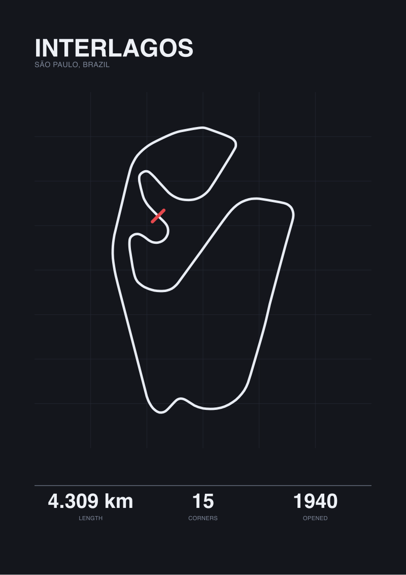 Interlagos
The print from this article · from €29.95
View the print →
Interlagos
The print from this article · from €29.95
View the print →
Question 3: What Is the Wall Already Doing?
Walls carry visual weight before anything is added to them. A bare wall in strong daylight, painted a single tone, with no adjacent furniture is doing almost nothing — it can carry a bold, high-contrast graphic without complaint. A wall next to a loaded bookshelf, above a sofa flanked by table lamps and cushions, opposite a large window, or below a picture rail that already carries three other frames is a working wall. The Interlagos print has to negotiate with that condition, and the negotiation goes one of two ways.
If the Wall Is Working
Go smaller and quieter. 40×50 cm or 50×70 cm, tone-on-tone or muted colourway, frame in thin black metal or unadorned oak. The print registers as an addition rather than a competitor. This is the correct choice for the wall above a well-dressed sofa — the mistake first-time buyers make is to centre a 70×100 cm high-contrast diagram above a sofa that already carries cushions, throws, side tables, and a rug. The print then loses the exchange. Neither the sofa nor the drawing wins the wall, and the room reads as busy rather than considered.
If the Wall Is Empty
Go larger. 70×100 cm minimum, and consider 100×140 cm if the wall is a stairwell landing, a dining-room end wall, or an entryway that receives visitors head-on. At 100 cm wide, the Interlagos trace prints at roughly 1:4,300 scale — the whole 4.308 km lap rendered as a single object at a scale that reads as a real drawing rather than a poster. This is when the print becomes the wall's argument. Do not undersize an empty wall; a small print on a large empty wall reads as timidity, and both the wall and the drawing deserve better than that.
If You Answered Everything: The Placement Map
Three questions, two branches each, eight combinations. Each row below is one path from opening question to recommended placement.
| Q1: Sit or Pass? | Q2: Read or Felt? | Q3: Wall Working? | Recommendation |
|---|---|---|---|
| Sit | Read | Working | 50×70 cm, oak frame, above desk or reading chair at seated eye-height |
| Sit | Read | Empty | 70×100 cm, black-on-white with scale bar, home office feature wall |
| Sit | Felt | Working | 40×50 cm, tone-on-tone, natural oak, dining sideboard or shelf-adjacent |
| Sit | Felt | Empty | 70×100 cm, muted colourway, opposite the primary lounge chair |
| Pass | Read | Working | 40×50 cm, high-contrast, thin black frame, kitchen alcove or hall niche |
| Pass | Read | Empty | 70×100 cm, black-on-white, stairwell landing at 160 cm to centre |
| Pass | Felt | Working | 30×40 cm, silhouette-only, guest bathroom or narrow corridor |
| Pass | Felt | Empty | 100×140 cm, silhouette on tinted stock, entryway end-wall |
Reading the table: two of the eight combinations demand a print larger than most first-time buyers instinctively reach for — the two "Empty" wall pairings, in either a seated or passing room. Two demand a print smaller than the studio's most popular size — the two "Working" wall pairings crossed with a felt-not-read intention. The remaining four sit in the 50×70 cm zone, which is why that size is the one that leaves the studio most often. If your answer path lands you at 50×70 cm, you have arrived at the honest default rather than the safe compromise.
The math residual is one metre. The published length of Interlagos is 4.309 km; the length we measure by tracing the OpenStreetMap raceway polyline is 4.308 km. Across an entire lap, that is a delta narrower than the racing groove worn into the tarmac at Junção. That one metre is the number that should decide whether you take our map-traced edition of the print, or the version that carries the official homologated figure printed alongside the scale bar — both are stocked in the /shop/. If a metre matters to you as a truth about the object on your wall, you already know which one. If it does not, the drawing is the same drawing, and only the caption changes.
FAQ
What size Interlagos print works best above a standard home office desk?
For a desk 120 to 160 cm wide with a wall clear above the monitor, 50×70 cm is the honest default. It sits comfortably at seated eye-height — 56 to 60 cm above the chair — and the Senna S, Curva do Sol and Ferradura sequences stay legible when you glance up from the screen. Go to 70×100 cm only if the desk is against a genuinely empty wall with at least 40 cm of clear space on either side of the frame.
Should the print's orientation match Interlagos's real-world compass direction?
The circuit runs anti-clockwise on a roughly north-south long axis, with the pit straight aligned close to north. Our prints are set with north up by default, matching the map convention. Some buyers rotate to landscape for wide walls, which shifts the pit straight to the horizontal. Both are defensible; the rotated version reads more as graphic gesture, the north-up version reads more as reference document. Question 2 tells you which to choose.
Why do the 4.309 km and 4.308 km figures for Interlagos both appear in circuit descriptions?
The 4.309 km figure is the officially homologated length recorded by the Autódromo José Carlos Pace and reported in reference sources including Wikipedia. The 4.308 km figure is what our studio measures when we trace the OpenStreetMap raceway polyline that defines the racing surface. The difference is one metre across the full lap, almost certainly a rounding difference between the circuit's own survey and the OSM contributors' GPS-derived geometry. Both are honest numbers.
Does a hallway really need a smaller frame than a living room?
Yes, and the reason is standing distance rather than wall area. Hallways rarely offer more than two metres between viewer and print, and often less. A 70×100 cm print at 1.5 m viewing distance overwhelms the fovea and forces the eye to reconstruct the layout from partial glances. A 40×50 cm print at the same distance sits inside a single glance and reads as a whole object. Circulation rooms want compact and high-contrast; sitting rooms can afford scale.
What lighting temperature reads a black-on-white circuit print best?
Daylight — 5000K to 6500K — is the honest reference, which is why north-facing windows are the ideal light source. If the wall is artificially lit, aim for 3000K or higher; anything below 3000K, meaning warm tungsten or older incandescent, shifts the white paper toward yellow and mutes the line contrast that makes the corner sequence legible. A directional picture light above the frame at 3000K works well; a single warm floor lamp in the room's main circulation zone does not.
Can an Interlagos print work in a bedroom without feeling clinical?
Yes, provided you follow the felt branch rather than the read branch. Bedrooms reject technical documents; a black-on-white diagram with kerb detail and turn labels feels out of register on a wall you look at while falling asleep. The tone-on-tone or muted colourway version — Interlagos as silhouette on a warm grey or deep navy stock, 40×50 cm to 50×70 cm — belongs in a bedroom in a way the diagrammatic version does not. It becomes a shape you know, not a document you are reading.
From the collection
New circuits and 10% off your first print.
One email now with your code. No noise after.