We have read most of what is written about F1 race track posters. Buying guides, gift roundups, "best of" edits, style explainers. Different bylines, different affiliate stacks, the same three failures repeated so consistently that they read like a single template passed hand to hand. The failures are not aesthetic. They are geometric. A poster of a circuit is a drawing of a real object — Spa-Francorchamps is 7.004 km of tarmac in Stavelot, Silverstone is 5.891 km in Northamptonshire, the Nürburgring Nordschleife is 20.832 km around Nürburg — and almost none of the coverage treats those objects as objects. Hear us out.
We spent a fortnight reading roundups of F1 race track posters — thirty-one of them, saved into a folder, annotated line by line. We were not looking for taste. We were looking for whether anyone writing about these prints had ever actually opened a map and traced the thing they were selling. The answer, with three partial exceptions we will not name, was no. What follows is the pattern we found, what those articles never say, and what a desk that draws circuits before it prints them would write instead.
What They All Get Wrong
The first failure is that they treat every circuit as if it were the same kind of object. A print of Silverstone, which is a permanent 5.891 km motor racing facility built on a former RAF airfield, is discussed in the same paragraph and with the same vocabulary as a print of the Nürburgring Nordschleife, which is a 20.832 km public toll road that wraps around a village in the Eifel and was opened in 1927. These are not two versions of the same thing scaled differently. One is a purpose-built stadium for racing; the other is a piece of infrastructure that grew out of a Weimar-era public works programme. A poster flattens both to the same black line on a cream background, and the coverage flattens them further by describing them with the same three adjectives.
The second failure is measurement. Almost every roundup we read quoted a circuit length without saying what that length means. Silverstone is 5.891 km — that is the FIA-homologated Grand Prix layout as measured along the racing line's centreline reference. Spa-Francorchamps is 7.004 km on the same basis. Our own trace of Spa, pulled from OpenStreetMap raceway geometry, comes out at 6.995 km — a nine-metre difference that reflects the gap between homologation documents and centreline map data, not a mistake in either. No poster article we read mentioned this gap. Most did not quote a length at all. Several quoted lengths that were simply wrong: rounded, outdated, or copied from a config layout that the print did not actually depict.
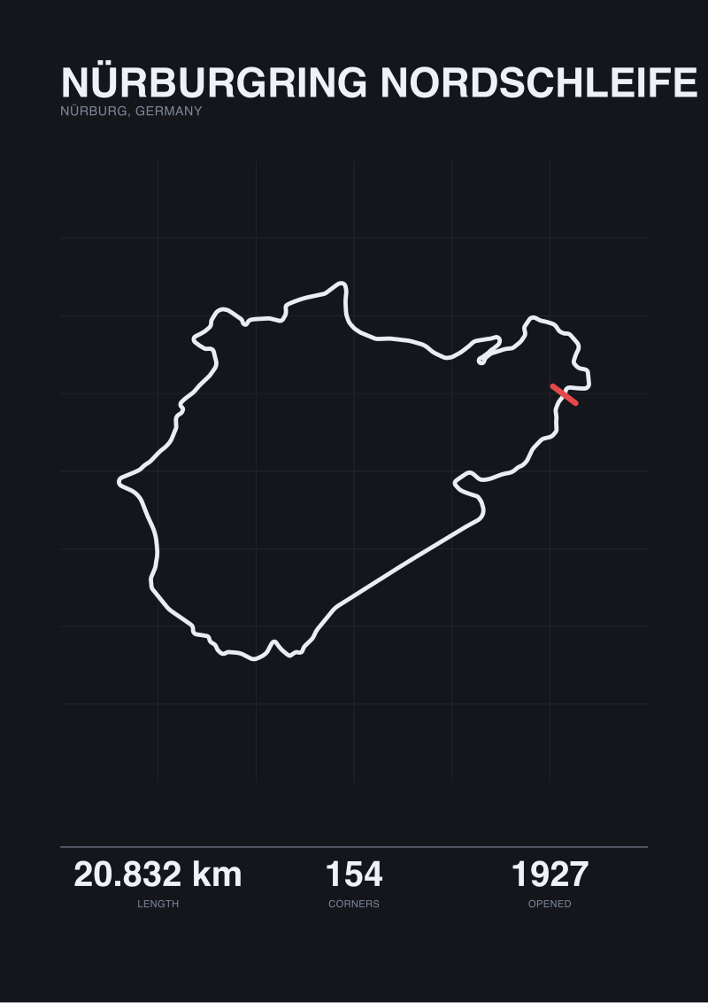
The third failure is corner counting. The Nordschleife has 154 turns depending on how you count them, and how you count them is not a detail — it is the entire argument about what the Nordschleife is. Spa has 19. Silverstone has 18. A poster that draws every corner as an equal-weight geometric event is making a claim about the circuit, and that claim is almost always wrong. The Nordschleife is not a circuit of 154 equally-important corners; it is a sequence of characters, some of which are named and some of which are transitional. Coverage that quotes "154 turns" as if it were a spec sheet number, without saying that the number is a convention, misleads the reader about the object on their wall.
The through-line across all three failures is that the writing treats the circuit as a logo. It is not a logo. It is a drawing of a piece of land.
What Is Almost Always Missing
What never appears in these articles is the geometry itself. Not "geometry" as a mood word — actual geometry. Length in metres, corner count, elevation, the ratio of straight to curve, the relationship between the fastest and slowest sections. A reader who wants to buy a poster of Spa-Francorchamps deserves to know that the circuit is 7.004 km long, has 19 turns, opened in 1921 in its original road-course form, and sits in Stavelot in the Belgian Ardennes at an elevation that swings by roughly one hundred metres over a single lap. None of that is exotic knowledge. All of it is public record. And yet the coverage of prints depicting this circuit will run 1,400 words about frame options and never mention any of it.
Also missing: the fact that circuits change. The Silverstone on a poster printed in 2011 is not the Silverstone on a poster printed in 2024, because the Arena layout was introduced in 2010 and the pit complex shifted between Club and Abbey afterwards. Spa's 2022 resurfacing changed the geometry of Raidillon in ways that show up if you overlay before-and-after traces. The Nordschleife's Flugplatz section was reprofiled after the 1976 accident that led to F1 leaving the circuit — the current 20.832 km configuration is not the 22.835 km configuration that Niki Lauda drove. No roundup we read mentioned which era of any circuit its recommended prints actually depicted. Buyers were told the print showed "the legendary Nürburgring" without any indication of which Nürburgring.
Also missing: the honest note that official published length and map-traced length disagree, and by how much, and why. Our trace of the Nordschleife comes in at 20.746 km against the official 20.832 km — 86 metres of difference across 20 km of tarmac, which is roughly what you would expect from measuring a centreline against a homologated racing-line reference. At Silverstone the gap is 10 metres. At Spa, 9. These are not errors. They are two different measurements of the same thing, and a print that claims fidelity to the circuit has an obligation to name which measurement its drawing follows. The affiliate coverage never gets near this.
And missing above all: the reader's actual interest. Someone who wants a Nordschleife poster on their wall is, with high probability, someone who has watched onboard footage of Bergwerk and Karussell and knows what those names mean. Writing that treats them as a generalist gift-guide reader — someone who needs to be told F1 is exciting and Spa is famous — is writing for an audience that does not exist and ignoring the one that does.
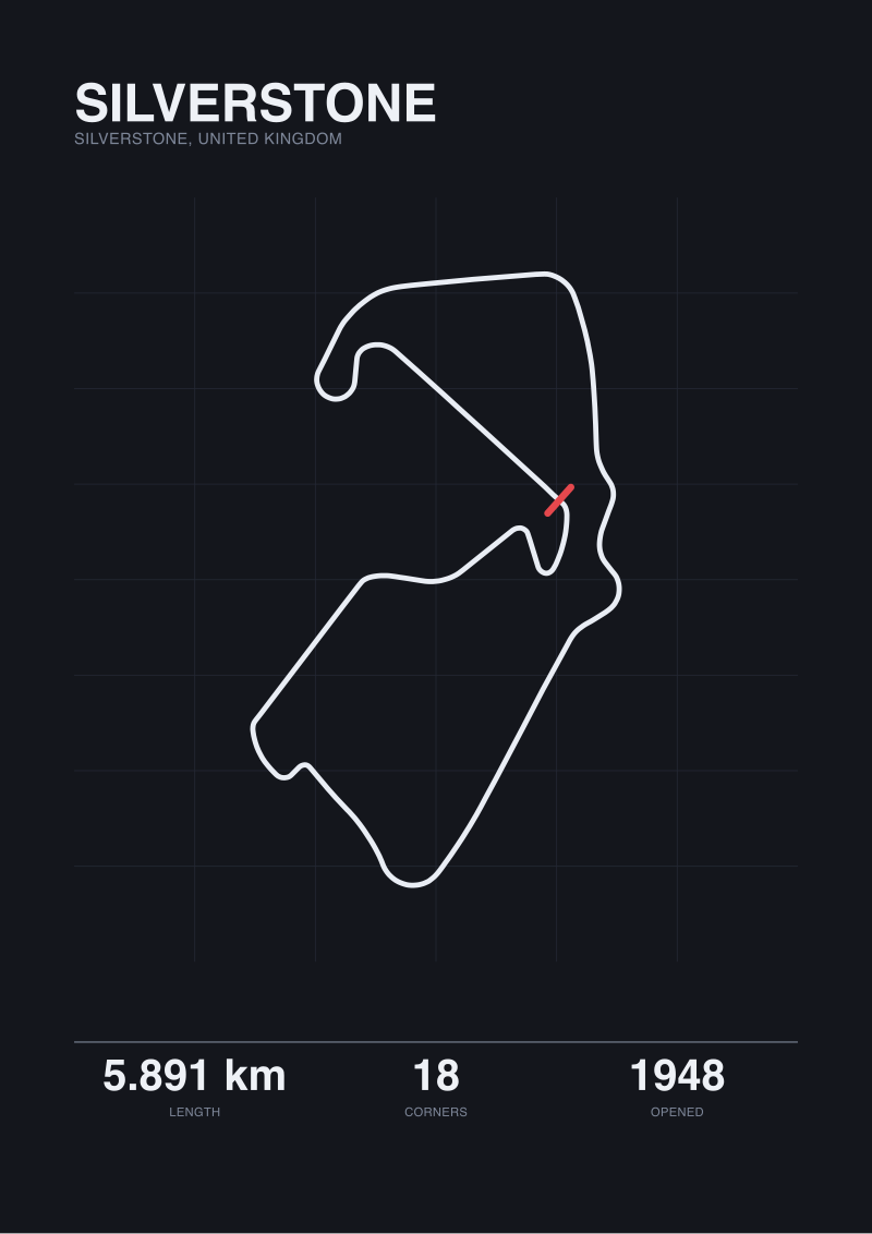 Silverstone
The print from this article · from €29.95
View the print →
Silverstone
The print from this article · from €29.95
View the print →
What I Would Say Instead
If we were writing the piece the search query asks for, we would begin by naming the object. A race track poster is a scaled orthographic drawing of a real piece of tarmac. The tarmac has a length in metres, a corner count that depends on how you define a corner, an opening year, a locality, and a history of reprofilings. Everything downstream — the frame, the paper stock, the colour palette — is decoration on top of that geometry. Coverage that starts with the decoration and never reaches the geometry has skipped the article and written the caption.
We would then take each circuit the piece covers and treat it as its own object. Spa-Francorchamps: 7.004 km along the current Grand Prix configuration, 19 turns, opened 1921 as a 15 km road course through Francorchamps, Malmedy and Stavelot, cut to its present shape in 1979, resurfaced most recently in 2022. A print of Spa is a print of that specific object as it stands today, or of an earlier configuration if the studio has been explicit about which year they traced. Silverstone: 5.891 km, 18 turns, opened 1948 on the perimeter roads of a decommissioned bomber airfield, reconfigured many times since — most consequentially in 2010 when the Arena section was added between Abbey and Brooklands. The Nordschleife: 20.832 km, 154 turns by the standard count, opened 1927 as a public works project, still open to the public on tourist days when no race is running. Each of these is a different kind of object with a different kind of history, and a poster of each carries a different set of claims.
We would name the measurement gap plainly. Our own map trace of Spa produces 6.995 km. The official homologated figure is 7.004 km. The nine-metre difference is not a defect of either number; it is the difference between OpenStreetMap centreline geometry and FIA racing-line reference, and any circuit print worth buying should tell you which of the two its drawing is based on. At the Nordschleife the same gap is 86 metres, and it matters more, because 20 km of forest road accumulates measurement error faster than 6 km of purpose-built tarmac. We would tell the reader this rather than hiding it.
We would refuse to recommend anything, because we do not run affiliate deals, and because the honest recommendation for a circuit print is the one traced from the circuit the buyer actually cares about, drawn by whoever draws it most faithfully. Our own studio drafts prints from OpenStreetMap raceway data under the ODbL, cross-checked against published homologation length, with the measurement basis stated on the back of the print. Those prints live at /shop/. That is the only commercial mention this piece contains, and it is here because a piece that criticises other coverage for burying its geometry would be dishonest if it did not disclose its own.
What we would not do is call any circuit iconic, or legendary, or the crown jewel of anything. Spa is 7.004 km of tarmac in the Ardennes. Silverstone is 5.891 km on a former RAF station. The Nordschleife is 20.832 km around Nürburg, with 154 turns and a history that predates most of the sport that now uses it. The circuits are their measurements and their histories. A poster is a drawing of those measurements. An article about the poster owes the reader the measurements first and everything else after.
FAQ
What length should an F1 race track poster show for Spa-Francorchamps?
The current Grand Prix configuration of Spa-Francorchamps is 7.004 km, homologated along the FIA racing-line reference. A map-traced centreline pulled from OpenStreetMap raceway data comes out at 6.995 km — a nine-metre gap that reflects two different measurement methods, not an error in either. A poster faithful to the circuit as it stands today should be based on one of these two figures, and a studio worth buying from will tell you which basis its drawing follows.
Which Nürburgring layout do most posters actually depict?
Most prints labelled "Nürburgring" show the Nordschleife in its current 20.832 km, 154-turn configuration — the one that has been in place, with minor changes, since the Flugplatz reprofiling that followed the 1976 accident. Earlier configurations, including the 22.835 km version Niki Lauda drove, are rarely offered outside specialist studios. If the circuit's era matters to you, ask the seller which year of the layout their trace is based on. Reputable studios will answer plainly.
Is the number of turns on a poster reliable?
It is a convention rather than a fact. The Nordschleife is commonly quoted at 154 turns, but that count depends on where one corner is judged to end and the next to begin. Spa has 19 turns by the current FIA count; Silverstone has 18. A poster that draws every corner as an equal-weight event is making a design choice, not reporting a spec. Treat the turn count as a useful shorthand, not a certified measurement.
Why do official circuit lengths and map-traced lengths disagree?
Official lengths are homologation figures measured along a defined racing-line reference, signed off by the FIA. Map-traced lengths come from centreline geometry in datasets such as OpenStreetMap. The two references do not coincide, so the numbers differ — by roughly ten metres at Silverstone and Spa, and by around 86 metres across the 20.832 km Nordschleife. Neither figure is wrong; they measure different things. A print that names its basis is being honest about what it drew.
Does it matter which year of a circuit the poster shows?
Yes, for circuits that have been reconfigured. Silverstone's current 5.891 km layout dates to the 2010 Arena reprofiling and subsequent pit-complex changes. Spa was resurfaced most recently in 2022, with small geometry changes around Raidillon. The Nordschleife's current 20.832 km form dates to post-1976 works. A poster of "Silverstone" without a year is ambiguous — the same circuit name has meant several different drawings in the last two decades.
Should I buy a poster of a circuit I have never visited?
That is a question about your taste, not about the circuit. What we would say is that the prints that reward long ownership tend to be of circuits whose geometry the owner has some relationship to — footage watched, laps driven in a sim, a race attended. A drawing of a piece of land you have no relationship to is decoration; a drawing of one you do is a map. Both are legitimate; the second tends to age better on a wall.
What should a good circuit print disclose about its source data?
At minimum: which layout year is depicted, what length figure the drawing uses (official homologation or traced centreline), and where the geometry data came from. Studios working from open datasets such as OpenStreetMap raceway data under the ODbL should say so, both because the licence requires attribution and because it lets a buyer verify the trace. A print with no source note is asking to be trusted without offering anything to trust.
Is there such a thing as a definitive F1 race track poster?
No, and any coverage that claims otherwise is selling something. A circuit is a physical object that has changed over time and is measured in more than one way. A poster is one studio's drawing of one configuration of that object, at one moment, from one data source. The best prints are the ones that are explicit about all four of those choices. Definitiveness is not on offer; honesty about method is, and it is the closest substitute.
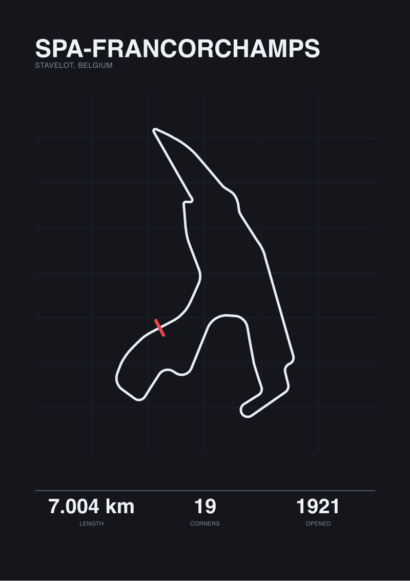 Spa-Francorchamps
The print from this article · from €29.95
View the print →
Spa-Francorchamps
The print from this article · from €29.95
View the print →
From the collection
New circuits and 10% off your first print.
One email now with your code. No noise after.