The strongest argument for buying a race circuit map as wall art is the one the industry rarely says out loud: a circuit is one of the few objects in a house that is both a drawing and a document. It records a decision. Every kink at Silverstone, every metre of Spa's descent to Eau Rouge, every one of the Nordschleife's 154 turns is a fact about the ground and about the people who drew a line across it. A good print, so the argument runs, is a piece of engineering hung on a wall. That argument is mostly right. It is also where most posters quietly cheat.
Why This Is Actually True
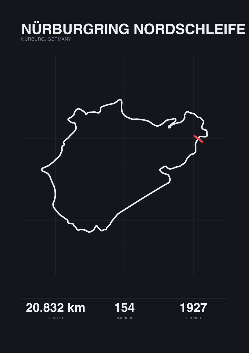
Start with the argument in its strongest form, because it deserves to be taken seriously. A circuit map is not decoration in the ordinary sense. It is a plan drawing of a specific ribbon of tarmac that exists, or existed, at a specific patch of ground. The Nürburgring Nordschleife runs through the Eifel hills at Nürburg, in Germany, and has since 1927. Spa-Francorchamps has occupied its stretch outside Stavelot, Belgium, since 1921. Silverstone was drawn onto a former airfield in the English Midlands in 1948. These are not aesthetic gestures. They are surveyed shapes with a history.
Hang one of them well and it teaches, quietly and repeatedly. The reader who lives with a Nordschleife print begins, after a month or two, to notice its 154 turns as a fact rather than a statistic. Twenty kilometres of road bent 154 times is not a normal ratio. Spa's 19 corners across seven kilometres is a different ratio, and after a while the wall tells you why the two circuits produce entirely different racing. Silverstone's 18 corners across 5.891 kilometres — the official figure — has yet another rhythm. None of this is on the print in words. It is in the geometry, which is why a map does what a photograph cannot: it strips away the marshals, the grandstands, the sky, and leaves only the drawing.
There is also, honestly, a status argument. A well-printed layout signals to any other reader of layouts that you understand what you own. It is the wall-hanging equivalent of a well-annotated technical manual. Ordinary posters do not survive that scrutiny. Studio prints, when they are made properly, do. That is the strongest case the industry can make for the format, and we agree with almost all of it.
But almost none of what the industry sells as a circuit print is drawn from a source that would survive an hour of technical scrutiny.
Where It Breaks Down
Consider a single number from our own working notes. Circuit de la Sarthe, the road course that hosts the 24 Hours of Le Mans, is officially 13.626 kilometres long. When we traced its layout from raw OpenStreetMap raceway geometry — the same open data source most independent print studios claim to use — the polyline came back at 0.793 kilometres.
That is not a small discrepancy. That is roughly 6% of the circuit. The rest is missing from the open dataset because most of Sarthe is public road that only becomes a circuit for one week a year, and the raceway-tagged geometry in OSM covers only the small permanent section around the Bugatti loop. This is a fact about the data, not about the circuit. But it is also a fact almost no poster shop discloses, because disclosing it would force them to answer an uncomfortable question: which shape are you actually printing?
The Nürburgring case is subtler and more revealing. The published Nordschleife length is 20.832 kilometres. Our map-traced number is 20.746 kilometres. The gap is 86 metres across a 20-kilometre road. Some of that is homologation choice — where exactly the start-finish reference sits, whether pit-lane geometry is included, whether the trace follows the racing line or the centreline. Some of it is measurement drift in the OSM polyline itself. Neither number is wrong. They are answers to slightly different questions, and a print that quotes one length without saying which one is doing something dishonest by omission.
Spa and Silverstone show the pattern at production scale. Spa-Francorchamps: 7.004 kilometres official, 6.995 traced — a 9-metre gap. Silverstone: 5.891 official, 5.881 traced — a 10-metre gap. Small, but consistent, and always in the same direction: the traced number is shorter because open-map geometry does not know which racing line the FIA homologated. Most posters print the official number in the caption and use the traced polyline for the drawing. The caption and the shape do not describe the same object. Nobody says so. This is the industry dirt: the format sells itself as documentary, and then quietly hopes you never audit it.
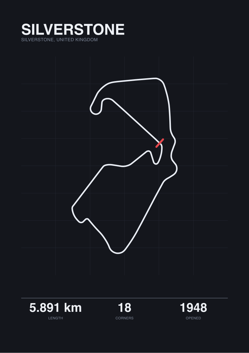 Silverstone
The print from this article · from €29.95
View the print →
Silverstone
The print from this article · from €29.95
View the print →
The Rule I Use Instead
The conventional buying advice for circuit prints is aesthetic: pick a layout you love, check the paper stock, mind the frame. That advice is not wrong, but it treats the print like a photograph, which is the category error. A circuit print is a technical drawing that happens to be framed. Judge it as one.
Three questions do most of the work. First: what is the geometry source, stated plainly on the print or in the studio's documentation? "OpenStreetMap raceway geometry, ODbL" is a real answer. "Traced from official homologation drawings" is another real answer. "AI-enhanced circuit rendering" is not an answer; it is a warning. If the studio cannot name the source, it does not have one.
Second: which length is displayed, and does the caption say which length it is? A print of Spa that reads "7.004 km" is quoting the official figure. A print that reads "6.995 km" is quoting a traced measurement. Either is defensible; neither should be undated or unexplained. If the length is shown to three decimal places without a note about basis, the studio is borrowing the authority of precision without earning it.
Third: does the corner count on the drawing match the circuit's published turn count? Spa is 19 corners. Silverstone is 18. The Nordschleife is 154. Count them on the print. You would be surprised how often the drawing has been simplified — a chicane collapsed into a bend, a fiddly complex smoothed into a single curve — because the artist decided the geometry looked better that way. A print that quietly deletes corners has stopped being a document and become an illustration. That is a legitimate object to own, but it is not what most posters claim to sell.
Apply those three questions and roughly nine out of ten circuit prints on the market fail at least one of them. That is not a marketing exercise. That is the actual condition of the category.
When the Old Rule Still Wins
There is a version of this argument we have to concede, and it is the one collectors care most about. Sometimes the emotional case beats the technical one. If a print is a memory of a specific day at Silverstone in 2001, or a first visit to the Nordschleife tourist-lap gate, the 10-metre discrepancy between an official 5.891 and a traced 5.881 is not the point. The point is that the shape on the wall matches the shape in the head. In that case, buy the poster you love, frame it well, and do not ask it to be a survey drawing.
We would only add one qualifier. The looser you are about the source, the more careful you should be about the caption. A print that makes no measurement claim asks nothing of you. A print that quotes a length to the metre and cannot say where the metre came from is asking you to trust it, and trust in this category is not free. If a studio wants both the numbers and the emotion, it has to earn both.
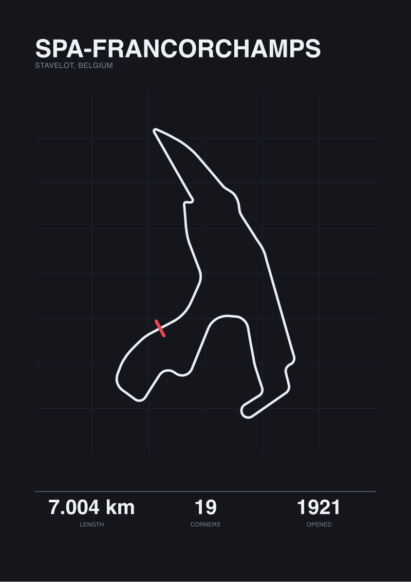 Spa-Francorchamps
The print from this article · from €29.95
View the print →
Spa-Francorchamps
The print from this article · from €29.95
View the print →
FAQ
What geometry source should a serious circuit print name?
The two credible answers are open surveyed data — OpenStreetMap raceway geometry under the ODbL licence is the most common — or the circuit's own homologation drawings, licensed from the operator. Either works. What does not work is a print that lists no source at all, or one that gestures at "official layout" without saying whose official. Our own studio prints trace from OSM raceway data because it is auditable; you can reproduce the polyline yourself and check our work.
Why do official circuit lengths and map-traced lengths disagree?
They answer slightly different questions. Homologated length is set by the sanctioning body, tied to a specific start-finish reference and a specific racing line, and locked into paperwork. Map-traced length is a polyline through the surveyed centreline of the road as it exists in open geodata. Spa's 9-metre gap between 7.004 km official and 6.995 km traced, or the Nordschleife's 86-metre gap between 20.832 and 20.746, are not errors. They are two honest measurements of two subtly different objects.
How do I check if a circuit print has been visually simplified?
Count the corners on the drawing and compare against the circuit's published turn count. Spa should show 19. Silverstone should show 18. If the print shows fewer, an artist has collapsed a chicane, smoothed a complex, or edited the drawing for aesthetic balance. That is not automatically wrong, but it means the print is an illustration of the layout, not a survey of it. Corner counts for older or reprofiled configurations differ, so match the count to the era the print claims to depict.
Why is Circuit de la Sarthe such a difficult layout to buy honestly?
Because most of it is public road for 51 weeks a year. The official Le Mans length is 13.626 kilometres, but open geodata only tags the small permanent Bugatti section as "raceway" — in our own trace, that returned as 0.793 kilometres. Any Sarthe print sold as map-traced is either using a private homologation drawing or has manually stitched public-road segments into the raceway polyline. Neither is disqualifying; not disclosing which is.
Is a paper stock or frame choice ever more important than the geometry?
Only when the print has already passed the geometry test. Paper weight, ink density, and framing matter for durability and presentation, and a badly framed accurate print looks worse than a well-framed inaccurate one at first glance. But the frame does not fix a corner that has been deleted or a length that has been fabricated. Judge the drawing first, then the object. The reverse order is how most poster buyers end up with wall art they cannot defend at close range.
Does the year the circuit opened matter for the print?
Only if the layout has been substantially revised since. Silverstone opened in 1948 on a former airfield and has been reprofiled repeatedly; a print sold as "Silverstone" is almost always a specific configuration, and the good ones say which. The Nordschleife opened in 1927 and its 154-turn count refers to the modern racing layout; historic long-course prints of the Nordschleife-plus-Südschleife are a different drawing entirely. Spa's 1921 origin, likewise, describes a much longer road course that the modern 7.004-kilometre circuit only partially retraces.
What is the honest limit of this guide?
This piece does not cover print production quality — ink permanence, paper archival ratings, or framing glass — because those are downstream of getting the drawing right, and we are not framers. It does not address circuits outside our own traced set beyond passing reference, so the specific numbers we quote apply to Silverstone, Spa, the Nordschleife and Sarthe; other layouts require their own audit. And it does not weigh in on which circuit is the most beautiful to hang, because that is a matter of taste and we sell prints, which makes us the wrong people to answer it.
From the collection
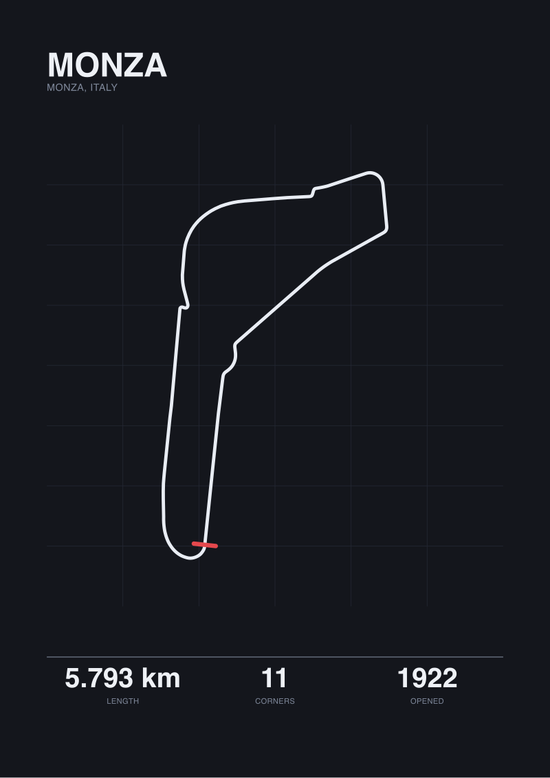
New circuits and 10% off your first print.
One email now with your code. No noise after.